History of logo
Logos of the BGK`s brand
A logo is one of the most powerful tools used to build an image and establish a brand association. When it is well designed, it is able to evoke emotions. Hence its power. You can often read more from a logo than from published statements or announcements. In its 100-year history, Bank Gospodarstwa Krajowego has operated under three official logos. And an unusual one.
The history of a company’s logo shows instantly what the company wanted to be, what it was and what values guided it at a given stage of its development. The case of Bank Gospodarstwa Krajowego is no different. By tracing the bank’s visual identity we can read what changes have taken place over the years in society, in the economy or in the financial market itself.
Not very coherent, but grand – BGK’s visual identity during the Second Commonwealth of Poland
W Polsce po 1918 r. zaczęło obowiązywać nowoczesne prawo patentowe, które przewidywało możliwość zastrzeżenia znaku firmowego. Nic jednak nie wskazuje na to, że BGK podjął w tym kierunku jakiekolwiek działania. Mimo tego – świadomie bądź nie – bank używał form wizualnych, aby komunikować klientom swój status.
In Poland, modern patent law came into force after 1918, which provided for the possibility of claiming a trademark. However, there is no indication that BGK took any steps in this direction. Nevertheless – consciously or not – the bank used visual forms to communicate its status to customers.
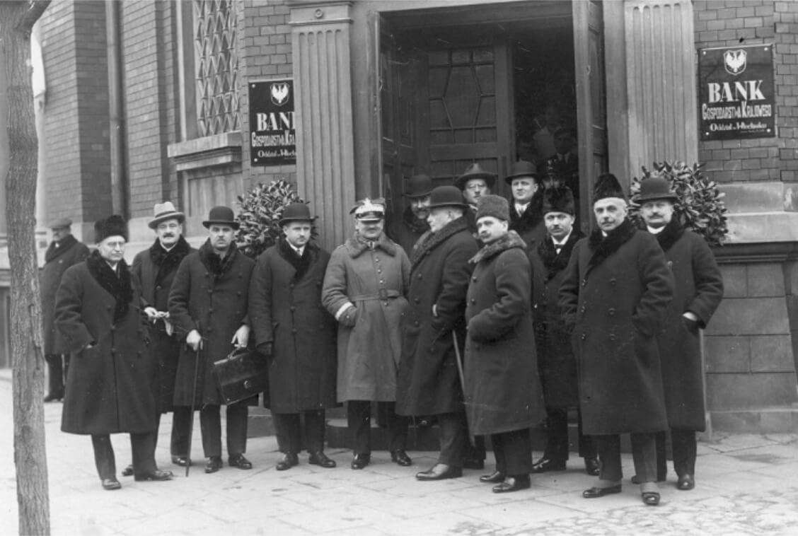
On official printed matter, stationery and buildings, the bank’s name was presented in simple, dignified writing, albeit in different typefaces. Importantly, the name was always accompanied by the emblem of the Commonwealth. The use of the eagle distinguished BGK from commercial banks such as Polska Kasa Opieki, whose logo already had the characteristics of a modern marketing tool.
What message does such a small identification convey? To answer this question, we need to be aware of the context in which these signs operated. And also how society perceived the state in the inter-war period. And it perceived it differently than today. After 1918, a revived, modern, independent statehood gave Poles hope for an improvement in their situation – for development and freedom from partitionist economic stagnation. Bank Gospodarstwa Krajowego wanted to be seen as an important component of the dynamic apparatus of the country – as the part carrying funds for economic and social development. BGK’s reference was the common good – the common wealth – rather than the short-sighted profit-oriented commercial market. This impression was also meant to be reinforced by its inclusion in the modernist style of the era.
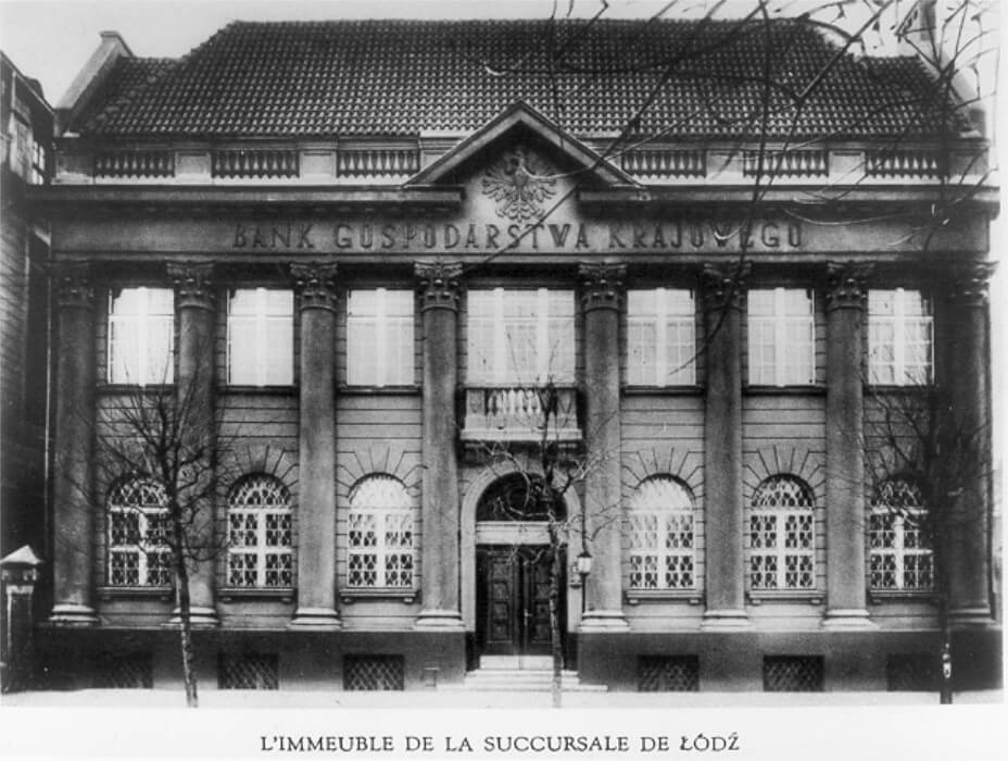
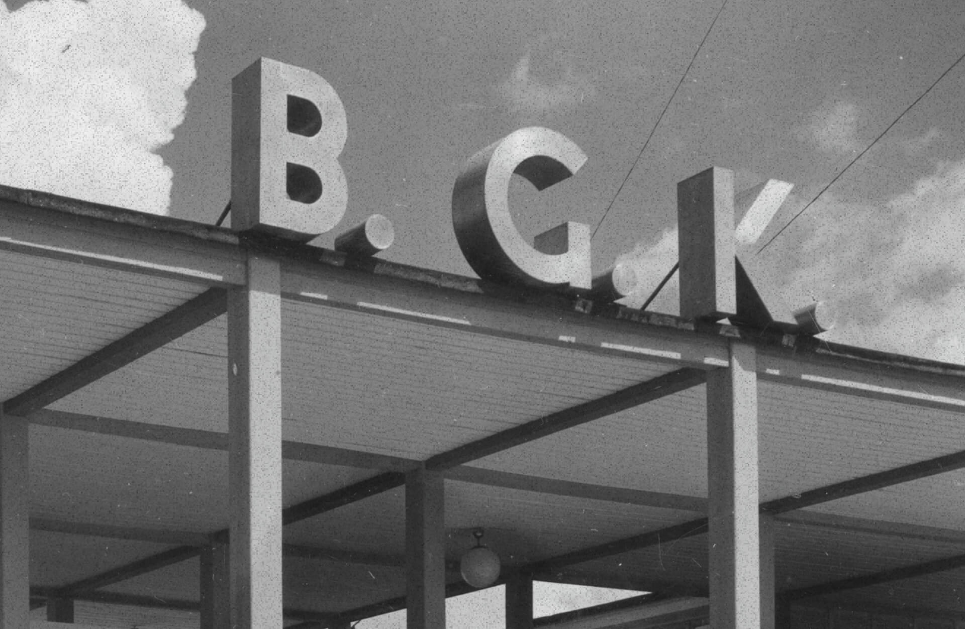
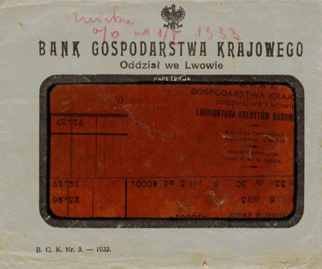
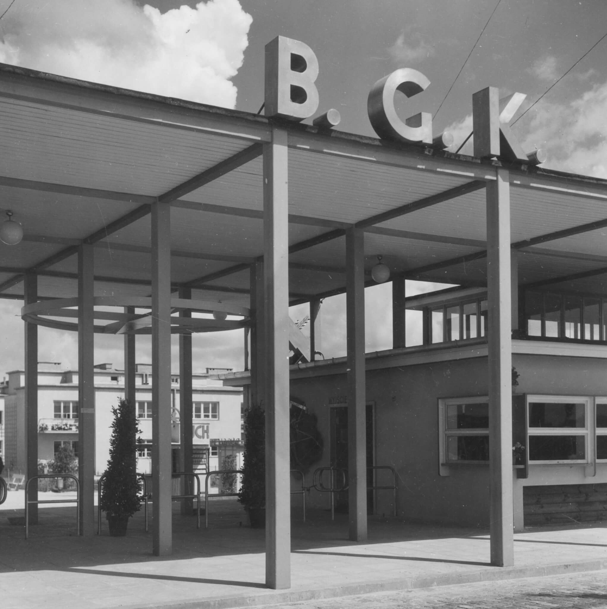
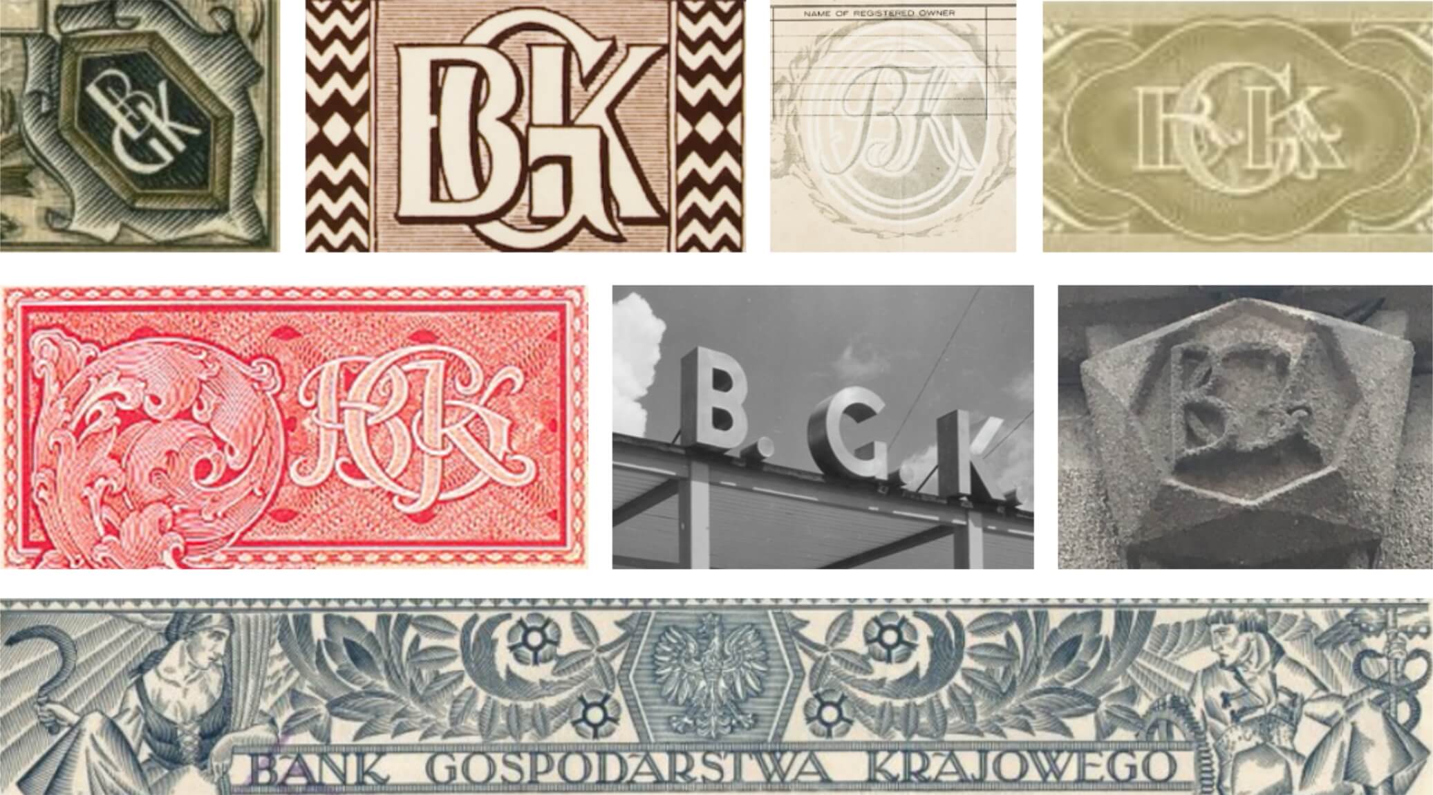
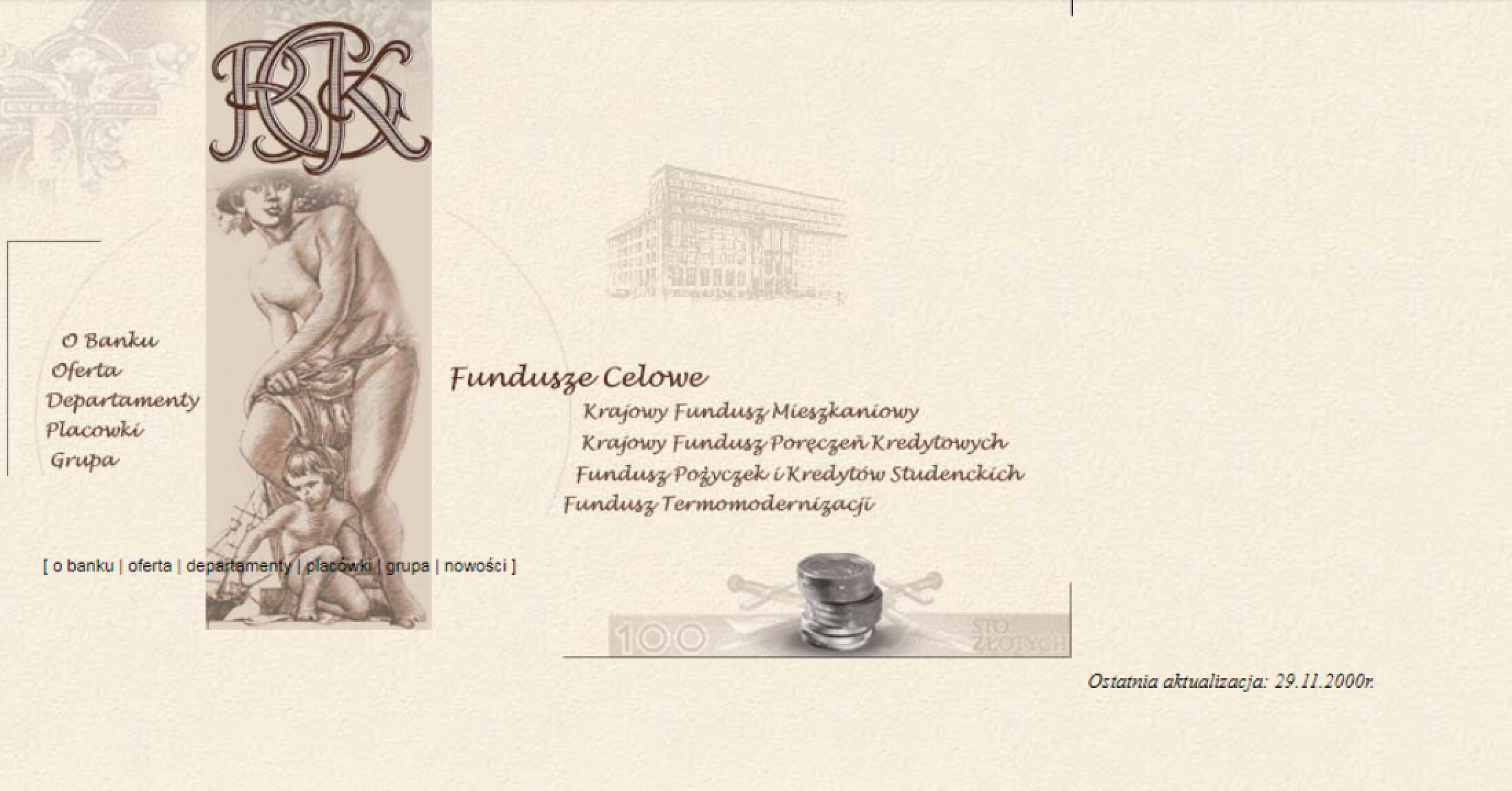
This was not yet a time when BGK cared for consistency in its visual identity. Different inscriptions of the bank’s name and abbreviation could be found on the buildings of its branches (in Katowice, Łódź, Lviv and Włocławek), above the gate of a housing exhibition in Koło (1935) or on the stand of Polish banks at the General National Exhibition in Poznań (1929). Interesting variations on the theme of the bank logo can also be found, for example, in the lapels of bank guards’ uniforms and on cutlery from the bank canteen.

Even different designs appeared on securities issued by BGK. It is worth noting that it was from the bonds, which were in the style of Polish art déco, that designers drew inspiration when designing the bank’s official logo for the 21st century.
The esoteric effect of the pyramid, a logo from the early 90s.
In the 1990s, there were discussions at the highest levels of administration, economics and finance about the various roles BGK was to play in the new, free-market reality. The reactivated bank – in addition to handling public funds – also carried out retail activities. What distinguished it from the pre-war institution was above all the widening of the scope of its activities. All this despite a more modest financial and accommodation base.
BGK also began to act as an agent for the issue of Treasury bonds. This referred to the pre-war traditions of the bank as an institution that mediated the country’s economic policy.
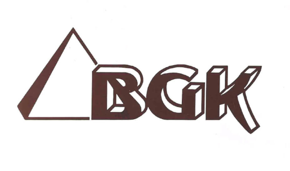
The atmosphere of free-market reality led the reborn bank to decide to introduce a modern visual identity. Interestingly, a pyramid appeared in the BGK logo in a 1990 report and on cheque books issued at the time. Czesław Gawłowski – the first president of the institution after 1989 – was behind this idea. The pyramid was intended not only as a magical symbol (immortality, the circle of life), but also as a protective symbol (the esoteric energy that the pyramids are supposed to emanate and protect those in its vicinity).
The three-dimensional typeface used for the logo captured the spirit of the time. This was when graphic designers were first able to use computers in their work. Many designers also tried to emphasise in their work that the age of colourful capitalism had arrived. In the case of BGK, however, they decided to tone it down a bit and at the same time allude to the historical origins of the institution. They chose brown for the main colour of the logo. This was to emphasise the tradition and experience behind BGK.

A visual return to tradition
Founded in 1870, Bank Handlowy avoided nationalisation in the People’s Republic of Poland and took over the handling of Polish foreign trade. In turn, the reactivated Bank Gospodarstwa Krajowego took over some of the tasks of Bank Handlowy, which involved handling state funds. This also involved the transfer of some employees including BGK’s second reactivated president, Mariusz Stolarz.
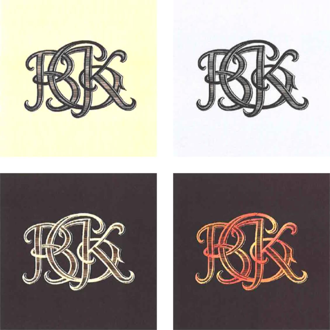
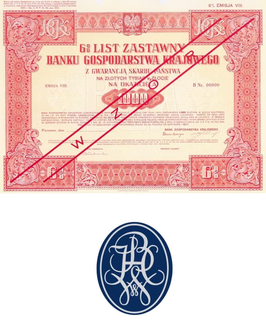
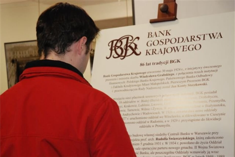
In 1993, the bank started using a new logo, i.e. an anagram presented in a traditional, stylised typeface. The mark was based on a motif found in a pledge letter issued by BGK in the 1930s. The new identity drew strongly on the history and traditions of the institution – it was based on browns and acanthus leaves, while at the same time the similarity to the Bank Handlowy logo was noticeable. The inspiration may have been twofold. Perhaps the management, with its origins in Bank Handlowy, wanted to draw on the way in which the institution visually emphasised its longevity. It could also have been about emphasising the taking over the tasks with which Bank Handlowy had hitherto been associated.

The impulse to realise plans and ambitions
W 2014 r. w BGK dokonał się graficzny zwrot ku nowoczesności.
In 2014, BGK took a graphic turn towards modernity. The progress and professionalisation that has been taking place in our bank over recent years should be reflected in the brand image. We are growing by investing in people, technology and increasing competences. For the market to recognise this, we also need to invest in our image.
explained Adrianna Lepka, BGK’s communications director, at the time of the change.
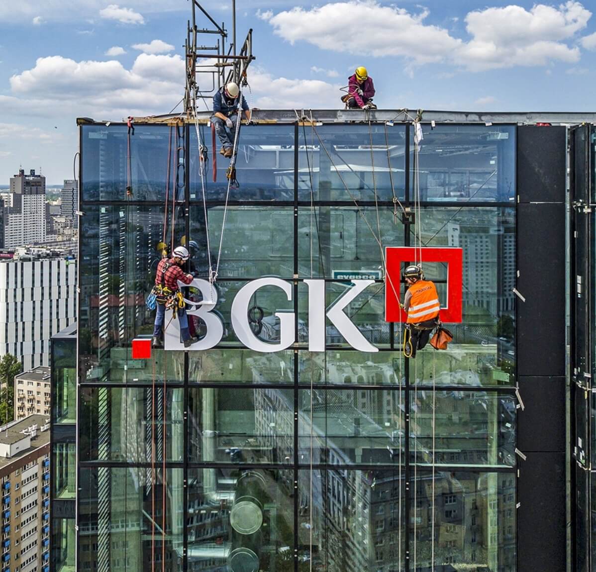
This modification covered all elements of the visual identity and the style of marketing communication. The most visible image change was the new logo, which featured squares. The square subconsciously implies support, solidity and stability. It is also a frequently used symbol in the identification of other banks (Raiffeisen Bank, DB or Société Générale).
In the case of the Bank Gospodarstwa Krajowego logo, the smaller red square symbolises the impetus by which a venture can gain momentum. The larger square, on the other hand, represents the effect of the investment. It is the space in which the plans and ambitions of BGK’s customers are realised.